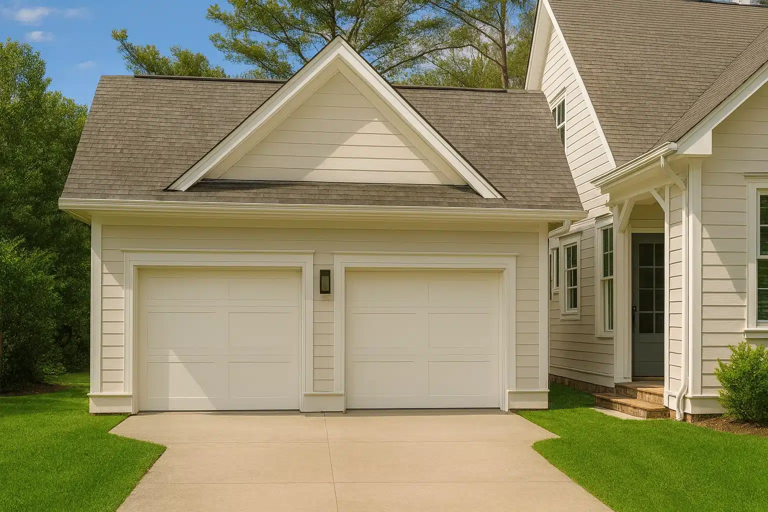
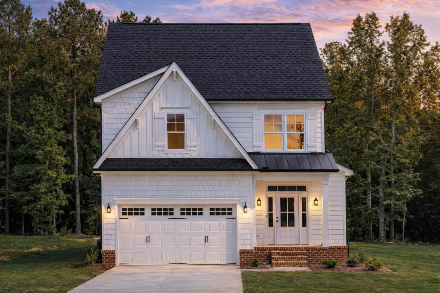
4 Bedroom House Plans – Stylish & Functional Designs for Modern Families
Explore Versatile and Comfortable 4 Bedroom House Plans Tailored to Your Lifestyle
Find Your Dream house

Why Choose a 4-Bedroom house?
A 4-bedroom house is an excellent choice whether you are building your dream family residence or creating a versatile space to accommodate guests. With an array of designs, floor plans, and blueprints available, customizing a 4-bedroom house plan has never been easier. Here’s why a 4-bedroom floor plan could be your ideal solution:
Found 3,002 House Plans!
-
/* =========================================================
1. KILL THE GHOST OVERLAY (The Fix)
========================================================= */
.short-description-hover,
.et_overlay,
.et_pb_module .product .et_overlay,
.woocommerce-loop-product__description {
display: none !important;
visibility: hidden !important;
opacity: 0 !important;
pointer-events: none !important;
height: 0 !important;
width: 0 !important;
overflow: hidden !important;
}
/* =========================================================
2. CUSTOM SHORT DESCRIPTION (Keep the Good One)
========================================================= */
/* 0) Card baseline */
ul.products li.product,
.products li.product {
position: relative;
overflow: visible;
}
/* 1) Force custom class to ALWAYS show & sit relatively */
.woocommerce ul.products li.product .mhfp-short-overlay,
.woocommerce-page ul.products li.product .mhfp-short-overlay,
ul.products li.product .mhfp-short-overlay {
/* Layout */
position: relative !important;
display: flex !important;
visibility: visible !important;
opacity: 1 !important;
/* Reset position */
top: auto !important;
bottom: auto !important;
left: auto !important;
right: auto !important;
transform: none !important;
/* Style */
background: transparent !important;
width: 100%;
margin: 0;
padding: 8px 4px;
box-sizing: border-box;
z-index: 10;
/* Text Alignment */
justify-content: space-evenly;
align-items: center;
text-align: center;
font-size: 11px !important;
line-height: 1.35 !important;
color: #ffc90d;
}
/* Styling for inner text */
.mhfp-short-overlay p {
margin: 0;
flex: 1 1 auto;
text-align: center;
}
.mhfp-short-overlay strong {
display: block;
color: #fff;
font-weight: 800;
}
/* --- FIX: FORCE UNHTD SF COLUMN TO THE TOP --- */
.mhfp-short-overlay p:nth-child(4) {
align-self: flex-start !important;
}
/* ------------------------------------------ */
/* Ensure it STAYS visible on hover */
ul.products li.product:hover .mhfp-short-overlay {
display: flex !important;
opacity: 1 !important;
background: transparent !important;
}
/* =========================================================
3. ICONS & BADGES
========================================================= */
/* Search Icon default position (overridden below for style) */
.product-search-icon {
position: absolute;
right: 0.75rem;
top: 0.75rem;
z-index: 60;
pointer-events: auto;
}
/* Sale Badge */
.mhfp-sale-badge {
display: inline-flex;
align-items: center;
line-height: 1;
white-space: nowrap;
position: absolute;
left: 6px;
top: 6px;
z-index: 50;
padding: 10px;
}
.mhfp-sale-badge .mhfp-sale-label {
margin-right: 0.35rem;
color: #fff !important;
font-weight: 800;
}
.mhfp-sale-badge .mhfp-sale-amount {
color: #ffc90d;
font-weight: 800;
}
/* Sale Badge Hover Logic */
@media (min-width: 981px) {
.mhfp-sale-badge {
opacity: 0;
transform: translateY(-4px);
transition: opacity .18s ease, transform .18s ease;
}
ul.products li.product:hover .mhfp-sale-badge {
opacity: 1;
transform: none;
}
}
@media (max-width: 980px) {
.mhfp-sale-badge {
opacity: 1;
transform: none;
}
}
/* =========================================================
4. RESPONSIVE & LAYOUT
========================================================= */
@media (max-width: 600px) {
.mhfp-short-overlay { font-size: 20px !important; }
.mhfp-sale-badge { font-size: 20px; padding: 14px; }
.product-search-icon { width: 34px; height: 34px; }
.product-search-icon svg { width: 16px; height: 16px; }
}
/* --- Short Overlay Layout Fixes --- */
/* === 1. Full-height columns with full-height separators (Revised) === */
.mhfp-short-overlay p {
display: flex;
flex-direction: column;
justify-content: center;
border-left: 2px solid rgba(255,255,255,0.25);
padding: 0 8px;
margin: 0 !important;
}
/* Remove default margin from the strong tag (the yellow numbers) */
.mhfp-short-overlay strong {
margin: 0 !important;
}
/* no separator on the first column */
.mhfp-short-overlay p:first-child {
border-left: none;
}
/* remove old override that shortened the last separator */
.mhfp-short-overlay p:nth-child(4) {
align-self: auto !important;
}
/* === 2. Outer bar container (Revised) === */
.mhfp-short-overlay {
padding-top: 8px !important;
padding-bottom: 8px !important;
padding-left: 0 !important;
padding-right: 0 !important;
display: flex;
align-items: stretch !important;
border: 2px solid rgba(255,255,255,0.25); /* Add an outer border */
border-radius: 4px; /* Add border radius */
}
/* === 3. Position bar against the image top & add space below === */
ul.products li.product .mhfp-short-overlay {
margin-top: -10px !important;
margin-bottom: 15px !important;
}
/* Remove just the top border so it doesn't touch the image */
.mhfp-short-overlay {
border-top: none !important;
}
/* Remove WooCommerce title spacing (this is what creates the gap) */
.woocommerce ul.products li.product .woocommerce-loop-product__title {
margin: 0 !important;
padding: 0 !important;
line-height: 1 !important;
}
/* ===========================================
SEARCH ICON → MATCH SALE BADGE STYLE
=========================================== */
.product-search-icon {
position: absolute;
right: 6px;
top: 6px;
z-index: 60;
/* Badge Style */
background: #25293b !important;
border-radius: 50%;
width: 50px;
height: 50px;
display: flex;
align-items: center;
justify-content: center;
box-shadow: 0 2px 6px rgba(0,0,0,0.25);
/* Hover Animation */
transition: transform .18s ease, box-shadow .18s ease;
cursor: pointer;
pointer-events: auto;
}
.product-search-icon:hover {
transform: translateY(-2px);
box-shadow: 0 4px 10px rgba(0,0,0,0.35);
}
/* Icon inside the badge */
.product-search-icon svg {
width: 22px;
height: 22px;
stroke: #ffc90d;
stroke-width: 2.2;
}
/* Make it visible on mobile (same as sale badge logic) */
@media (max-width: 980px) {
.product-search-icon {
opacity: 1 !important;
transform: none !important;
}
}
/* ==================================================
FIXED: POINTER-EVENTS RESET (The most robust fix)
================================================== */
/* 1. Kill ALL default click-stealing behavior on the list item and wrapper links */
ul.products li.product,
.products li.product {
pointer-events: none !important; /* Disables all clicks on the main card */
}
/* 2. Re-enable clicks ONLY on the desired elements */
ul.products li.product .woocommerce-loop-product__link, /* Product Image/Title */
ul.products li.product .product-search-icon, /* Search Icon (for lightbox) */
ul.products li.product .mhfp-short-overlay, /* Short Desc/Stats */
ul.products li.product .mhfp-sale-badge, /* Sale Badge (if links) */
/* Re-enable clicks only on specific elements to fix Divi's double link wrapping */
.et_pb_shop > a:first-child[href*="product"],
.et_pb_wc_products > a:first-child[href*="product"] {
pointer-events: auto !important;
cursor: pointer !important; /* Forces the hand cursor to show */
}
/* Final Divi Fix (must be separated) */
ul.products li.product a.et_shop_image,
ul.products li.product > a:first-child[href*="product"],
.et_pb_shop a[href*="product"]:not(.woocommerce-loop-product__link) {
pointer-events: none !important;
cursor: default !important;
}
.product-search-icon,
.mhfp-short-overlay {
pointer-events: auto !important;
}/* =========================================================
1. KILL THE GHOST OVERLAY (The Fix)
========================================================= */
.short-description-hover,
.et_overlay,
.et_pb_module .product .et_overlay,
.woocommerce-loop-product__description {
display: none !important;
visibility: hidden !important;
opacity: 0 !important;
pointer-events: none !important;
height: 0 !important;
width: 0 !important;
overflow: hidden !important;
}
/* =========================================================
2. CUSTOM SHORT DESCRIPTION (Keep the Good One)
========================================================= */
/* 0) Card baseline */
ul.products li.product,
.products li.product {
position: relative;
overflow: visible;
}
/* 1) Force custom class to ALWAYS show & sit relatively */
.woocommerce ul.products li.product .mhfp-short-overlay,
.woocommerce-page ul.products li.product .mhfp-short-overlay,
ul.products li.product .mhfp-short-overlay {
/* Layout */
position: relative !important;
display: flex !important;
visibility: visible !important;
opacity: 1 !important;
/* Reset position */
top: auto !important;
bottom: auto !important;
left: auto !important;
right: auto !important;
transform: none !important;
/* Style */
background: transparent !important;
width: 100%;
margin: 0;
padding: 8px 4px;
box-sizing: border-box;
z-index: 10;
/* Text Alignment */
justify-content: space-evenly;
align-items: center;
text-align: center;
font-size: 11px !important;
line-height: 1.35 !important;
color: #ffc90d;
}
/* Styling for inner text */
.mhfp-short-overlay p {
margin: 0;
flex: 1 1 auto;
text-align: center;
}
.mhfp-short-overlay strong {
display: block;
color: #fff;
font-weight: 800;
}
/* --- FIX: FORCE UNHTD SF COLUMN TO THE TOP --- */
.mhfp-short-overlay p:nth-child(4) {
align-self: flex-start !important;
}
/* ------------------------------------------ */
/* Ensure it STAYS visible on hover */
ul.products li.product:hover .mhfp-short-overlay {
display: flex !important;
opacity: 1 !important;
background: transparent !important;
}
/* =========================================================
3. ICONS & BADGES
========================================================= */
/* Search Icon default position (overridden below for style) */
.product-search-icon {
position: absolute;
right: 0.75rem;
top: 0.75rem;
z-index: 60;
pointer-events: auto;
}
/* Sale Badge */
.mhfp-sale-badge {
display: inline-flex;
align-items: center;
line-height: 1;
white-space: nowrap;
position: absolute;
left: 6px;
top: 6px;
z-index: 50;
padding: 10px;
}
.mhfp-sale-badge .mhfp-sale-label {
margin-right: 0.35rem;
color: #fff !important;
font-weight: 800;
}
.mhfp-sale-badge .mhfp-sale-amount {
color: #ffc90d;
font-weight: 800;
}
/* Sale Badge Hover Logic */
@media (min-width: 981px) {
.mhfp-sale-badge {
opacity: 0;
transform: translateY(-4px);
transition: opacity .18s ease, transform .18s ease;
}
ul.products li.product:hover .mhfp-sale-badge {
opacity: 1;
transform: none;
}
}
@media (max-width: 980px) {
.mhfp-sale-badge {
opacity: 1;
transform: none;
}
}
/* =========================================================
4. RESPONSIVE & LAYOUT
========================================================= */
@media (max-width: 600px) {
.mhfp-short-overlay { font-size: 20px !important; }
.mhfp-sale-badge { font-size: 20px; padding: 14px; }
.product-search-icon { width: 34px; height: 34px; }
.product-search-icon svg { width: 16px; height: 16px; }
}
/* --- Short Overlay Layout Fixes --- */
/* === 1. Full-height columns with full-height separators (Revised) === */
.mhfp-short-overlay p {
display: flex;
flex-direction: column;
justify-content: center;
border-left: 2px solid rgba(255,255,255,0.25);
padding: 0 8px;
margin: 0 !important;
}
/* Remove default margin from the strong tag (the yellow numbers) */
.mhfp-short-overlay strong {
margin: 0 !important;
}
/* no separator on the first column */
.mhfp-short-overlay p:first-child {
border-left: none;
}
/* remove old override that shortened the last separator */
.mhfp-short-overlay p:nth-child(4) {
align-self: auto !important;
}
/* === 2. Outer bar container (Revised) === */
.mhfp-short-overlay {
padding-top: 8px !important;
padding-bottom: 8px !important;
padding-left: 0 !important;
padding-right: 0 !important;
display: flex;
align-items: stretch !important;
border: 2px solid rgba(255,255,255,0.25); /* Add an outer border */
border-radius: 4px; /* Add border radius */
}
/* === 3. Position bar against the image top & add space below === */
ul.products li.product .mhfp-short-overlay {
margin-top: -10px !important;
margin-bottom: 15px !important;
}
/* Remove just the top border so it doesn't touch the image */
.mhfp-short-overlay {
border-top: none !important;
}
/* Remove WooCommerce title spacing (this is what creates the gap) */
.woocommerce ul.products li.product .woocommerce-loop-product__title {
margin: 0 !important;
padding: 0 !important;
line-height: 1 !important;
}
/* ===========================================
SEARCH ICON → MATCH SALE BADGE STYLE
=========================================== */
.product-search-icon {
position: absolute;
right: 6px;
top: 6px;
z-index: 60;
/* Badge Style */
background: #25293b !important;
border-radius: 50%;
width: 50px;
height: 50px;
display: flex;
align-items: center;
justify-content: center;
box-shadow: 0 2px 6px rgba(0,0,0,0.25);
/* Hover Animation */
transition: transform .18s ease, box-shadow .18s ease;
cursor: pointer;
pointer-events: auto;
}
.product-search-icon:hover {
transform: translateY(-2px);
box-shadow: 0 4px 10px rgba(0,0,0,0.35);
}
/* Icon inside the badge */
.product-search-icon svg {
width: 22px;
height: 22px;
stroke: #ffc90d;
stroke-width: 2.2;
}
/* Make it visible on mobile (same as sale badge logic) */
@media (max-width: 980px) {
.product-search-icon {
opacity: 1 !important;
transform: none !important;
}
}
/* ==================================================
FIXED: POINTER-EVENTS RESET (The most robust fix)
================================================== */
/* 1. Kill ALL default click-stealing behavior on the list item and wrapper links */
ul.products li.product,
.products li.product {
pointer-events: none !important; /* Disables all clicks on the main card */
}
/* 2. Re-enable clicks ONLY on the desired elements */
ul.products li.product .woocommerce-loop-product__link, /* Product Image/Title */
ul.products li.product .product-search-icon, /* Search Icon (for lightbox) */
ul.products li.product .mhfp-short-overlay, /* Short Desc/Stats */
ul.products li.product .mhfp-sale-badge, /* Sale Badge (if links) */
/* Re-enable clicks only on specific elements to fix Divi's double link wrapping */
.et_pb_shop > a:first-child[href*="product"],
.et_pb_wc_products > a:first-child[href*="product"] {
pointer-events: auto !important;
cursor: pointer !important; /* Forces the hand cursor to show */
}
/* Final Divi Fix (must be separated) */
ul.products li.product a.et_shop_image,
ul.products li.product > a:first-child[href*="product"],
.et_pb_shop a[href*="product"]:not(.woocommerce-loop-product__link) {
pointer-events: none !important;
cursor: default !important;
}
.product-search-icon,
.mhfp-short-overlay {
pointer-events: auto !important;
}
Bedroom House Plans – Spacious, Stylish & Functional Designs
When it comes to building the perfect forever house, 4 bedroom house plans offer the ideal balance of flexibility, space, and long-term livability. Whether you’re planning for a growing family, regular guests, or simply want designated rooms for work and hobbies, these layouts deliver the square footage and smart design choices you need.
At MyHomeFloorPlans.com, every one of our 4 bedroom house plans includes CAD files and PDFs, comes with an unlimited build license, and includes structural engineering—something many of our competitors can’t match. From modern farmhouse styles to elegant luxury estates, you’ll find a plan that fits your vision and budget.
Why Choose a 4 Bedroom House Plan?
- Room to Grow: Perfect for families, 4 bedrooms mean kids don’t have to share—or you can set up a nursery, guest room, or home office with ease.
- Flexible Use: One of the bedrooms can double as a hobby room, gym, or playroom depending on your lifestyle needs.
- Boost Resale Value: 4 bedroom homes consistently perform better in real estate markets across the U.S., increasing long-term ROI.
- Ideal for Multi-Generational Living: Consider adding an extra owner’s suite or an in-law suite layout for more privacy and convenience.
Popular 4 Bedroom Layouts
There’s more than one way to configure a 4 bedroom home. Here are a few popular arrangements:
- Split Bedroom Design: Places the primary suite on one side and the secondary bedrooms on the other.
- Jack and Jill Bathrooms: Perfect for shared access between two children’s rooms.
- Upstairs Bedrooms: Great for households who want to keep main-level living private.
- Walkout Basements: Include additional rec rooms or bedrooms for guests or rental potential.
Browse related options like our 5 Bedroom House Plans or 3 Bedroom House Plans if you’re seeking more or less space.
Architectural Styles for 4 Bedroom House Plans
Our 4 bedroom house plans span every major style, including:
- Farmhouse – Featuring open-concept layouts and wrap-around porches
- Modern Suburban – Blending sleek finishes with practical space
- Ranch – All one level, perfect for accessibility
- Classical or Victorian – Great for those who love symmetry and elegance
All Plans Include These Benefits
- Unlimited Builds: Build your house as many times as you want without paying again.
- CAD + PDF Files: Instantly downloadable blueprints and editable formats.
- Free Foundation Changes: Choose between slab, crawlspace, or basement at no extra cost.
- Structural Engineering Included: Save money and prevent build issues down the road.
Other providers often charge hundreds for these upgrades. That’s why we say we offer better house plans, for less.
Explore Similar Collections
If you love 4 bedroom layouts, you may also want to check out:
- Two Owner Suite House Plans
- Top-Selling House Plans
- Narrow Lot House Plans
- Family-Friendly House Plans
Need Help Finding the Right Fit?
Use our search tool to filter 4 bedroom house plans by square footage, style, number of floors, garages, outdoor features, and more. Or reach out to our team for custom modifications tailored to your lot or lifestyle.
We also recommend reviewing your local building codes before finalizing your selection.
Ready to Build Your Dream House?
Explore our full collection of 4 Bedroom House Plans today and download everything you need—instantly.
Frequently Asked Questions
Who are 4 bedroom house plans best suited for?
They’re ideal for larger families, multigenerational households, or homeowners who want extra rooms for guests, offices, or hobbies.
Can I convert a bedroom into a house office or gym?
Absolutely. Many 4-bedroom designs offer layout flexibility, making it easy to convert one or more bedrooms into an office, studio, or workout space.
Are there options for separate in-law or guest suites?
Yes — several of our 4-bedroom plans include private guest suites, complete with en-suite baths, or layouts that support ADU-style wings.
Can I find 4 bedroom houses under 2,000 sq. ft.?
Definitely. We offer compact 4-bedroom floor plans under 2,000 square feet that maximize usable space while staying budget-friendly.
What customization is available for 4 bedroom house plans?
Every plan includes CAD + PDF files and unlimited build licenses. You can request layout changes, foundation swaps, or structural adjustments free of charge.